Saturday, October 17, 2009

Check out this song

Alex Cook just released his new album "Tree of Life." Here's what he says about it:

The funk, reggae, and rock grooves on Tree Of Life bounce with deep reverence and joy. They don’t so much talk about God as they express what it feels like to be loved by God, living, exploring, and growing powerfully as His child. The songs are infused with a holy feeling of listening to the inner voice, and striking out on its soulful adventure. “Notes That Money Can’t Buy,” a rocking reggae number, declares that we are the notes of God’s own song while “You Can’t Take My Life Away” ends the album by confidently defying fear and doubt.

I heard him play some of these at a concert. Really liked this one, "Oh My Soul"

Buy a copy of the album for download

Friday, February 15, 2008

Missing Link in design: Indi Young's "Mental Models" book

Want to get your strategy and design right? Here's a must read: "Mental Models: Aligning Design Strategy with Human Behavior" by Indi Young. I just bought the book yesterday (you get a PDF too if you buy it through the link above). Although I have not yet read it, I did see a presentation by Indi Young of the Mental Model process at Adaptive Path's UXWEEK2008 conference in Washington D.C. last summer, and have been eagerly awaiting this book. The presentation clearly explained the methodology for understanding user needs, motivations, and behaviors to inform strategy and design. Great tool for designers, user experience specialists, and managers. Don't start another project without reading this book first.


Monday, January 28, 2008

A new way to look at Christian Science

Christian Science on the web just got a whole lot more accessible, usable, colorful and moving (in the sense of video). The new site features videos of Christian Scientists telling what Christian Science means to them and examples of how it has brought healing. There are also FAQs, core beliefs, tons of articles, and a discussion area. If you've ever wondered what Christian Science is all about or have something to share about it, this is the place to go.


Tuesday, November 13, 2007

at the apple store


Photo 4
Originally uploaded by welcometoalville

Just a little time out to reflect on what a cool world we live in (in a techno-social-culture kind of way at least), especially with things like the MAC. Here I am at the Mac store at the CambridgeSide Galleria. Took a photo with photobooth, uploaded it to FLICKr and now blogging about it --- all in five minutes. Yeah cool. The challenge is to do something great with this capability, but the fact remains that this is amazing. And it's made all the more wonderful by the toil of the folks at Mac, FLICKr, and Blogspot to create User Experiences that streamline the whole process and create that ultimate goal of User Experience --- DELIGHT.


Wednesday, September 12, 2007

Great branding presentation

Branding is always a hot topic anytime you have strategic and creative people together thinking about how to provide a product or service. This presentation makes some good points including the fact that your customers, not you, often decide what your brand is. See slides 13-18. And principles that apply to retail packaging (slides 100-103) also apply in many other mediums...the Web for example.

Tuesday, August 28, 2007

User Experience...where's the delight?

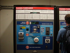
I was in Washington, D.C. for a User Experience conference, so it's fitting that, while out with some fellow UXers there was a run-in with bad user experience. And as you might expect, we ruthlessly picked apart our victim, a Metro farecard vending machine.

The machine that took cash was actually easy to use. The machine pictured here was for credit/debit cards. It was a shining example of everything you would not want to experience while purchasing a farecard in a subway, particularly during rush hour or late at night, which was the case on two separate occasions.

It was so bad, one had to wonder...did the designers intentionally create a bad user experience? It's hard to imagine that it could be this bad UNintentionally. (Though, thinking of how bad UX happens to good designers -- from personal experience, I realize I should cut them some slack).

The problems: Not clear where the process starts or ends (in spite of the big numbers) or what to expect when it does, quirky affordances/buttons (and of every conceivable variety -- something for everyone), counterintuitive task-flow, miniscule type indicating the arcane fare structure...the list goes on (click on the photo to see a larger version...see if you can figure it out).

My advice if you find yourself visiting D.C. and staring blankly at the farecard machine? Buy the default $20.00 ticket and you'll probably never have to deal with the process again...you can relax and enjoy the Metro, which is quite nice once you get past this maddening gatekeeper.


Friday, March 16, 2007

Ever heard of punctuation?

I was all ready to present this as the well-written counterpoint to the wordy fire exit sign (see adjacent blog entry), but then realized that, though it does get the point across in as few words as possible, it lacks punctuation that would make it truly stellar. Still, it IS just a fire exit sign. I suppose the lack of punctuation is forgivable.

Why we need editors

Every day I walk by two fire doors on the way to work. I can't help but notice the extreme wordiness in contrast to the clear and efficient use of words in the sign on the other fire door a few feet away (see the adjacent blog entry). One has to wonder how this sign ever saw the light of day. Who wrote it? Who edited it? And how about that "instant use" terminology? Sounds like it was borrowed from a moist towelette package.