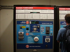
I was in Washington, D.C. for a User Experience conference, so it's fitting that, while out with some fellow UXers there was a run-in with bad user experience. And as you might expect, we ruthlessly picked apart our victim, a Metro farecard vending machine.
The machine that took cash was actually easy to use. The machine pictured here was for credit/debit cards. It was a shining example of everything you would not want to experience while purchasing a farecard in a subway, particularly during rush hour or late at night, which was the case on two separate occasions.
It was so bad, one had to wonder...did the designers intentionally create a bad user experience? It's hard to imagine that it could be this bad UNintentionally. (Though, thinking of how bad UX happens to good designers -- from personal experience, I realize I should cut them some slack).
The problems: Not clear where the process starts or ends (in spite of the big numbers) or what to expect when it does, quirky affordances/buttons (and of every conceivable variety -- something for everyone), counterintuitive task-flow, miniscule type indicating the arcane fare structure...the list goes on (click on the photo to see a larger version...see if you can figure it out).
My advice if you find yourself visiting D.C. and staring blankly at the farecard machine? Buy the default $20.00 ticket and you'll probably never have to deal with the process again...you can relax and enjoy the Metro, which is quite nice once you get past this maddening gatekeeper.


1 comment:
Yeeach! It's like one of those Fisher-Price toys for babies, with all the bells and buttons and flishing lights. And why would you want to deduct value from your pass?
Post a Comment